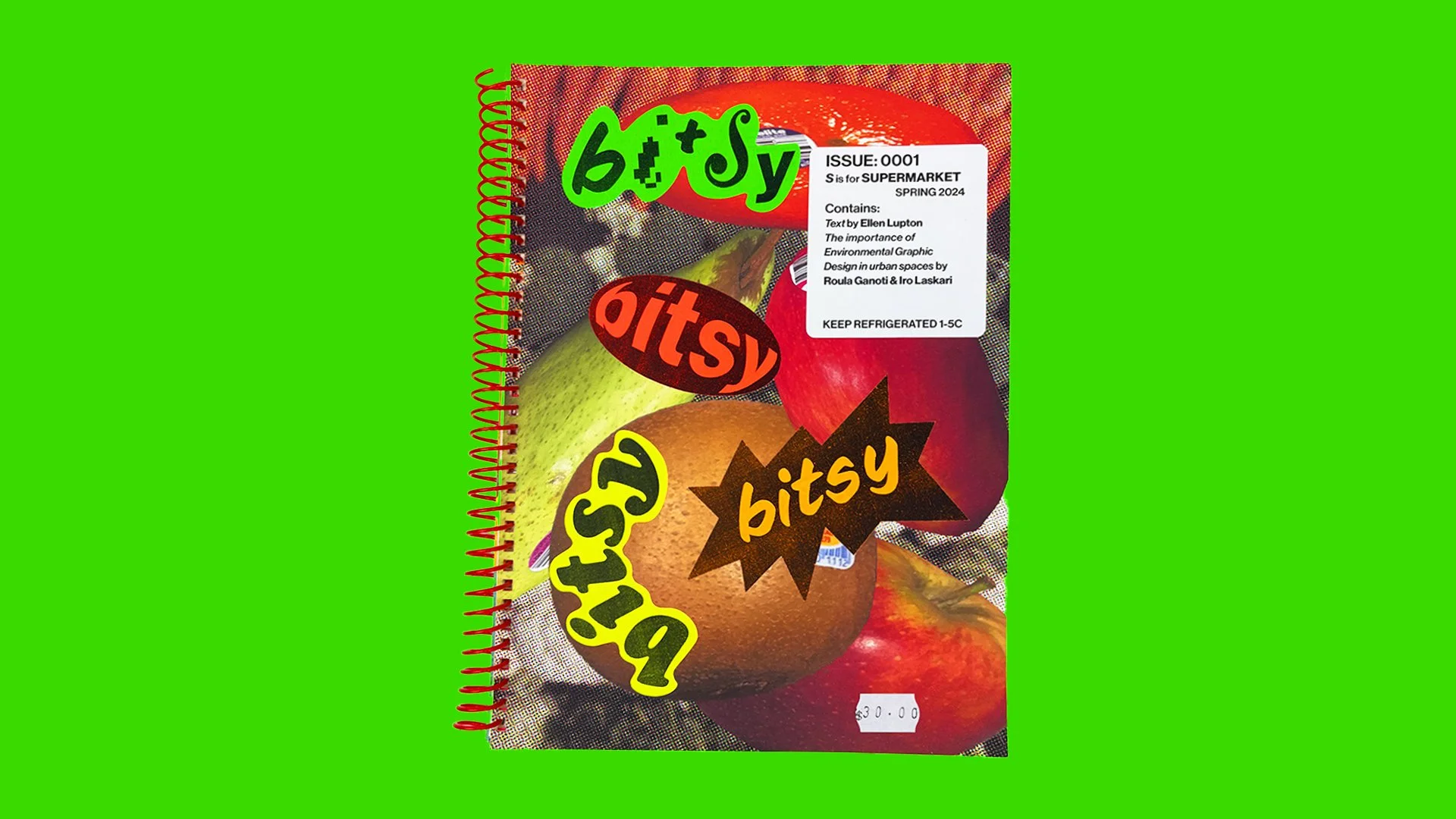
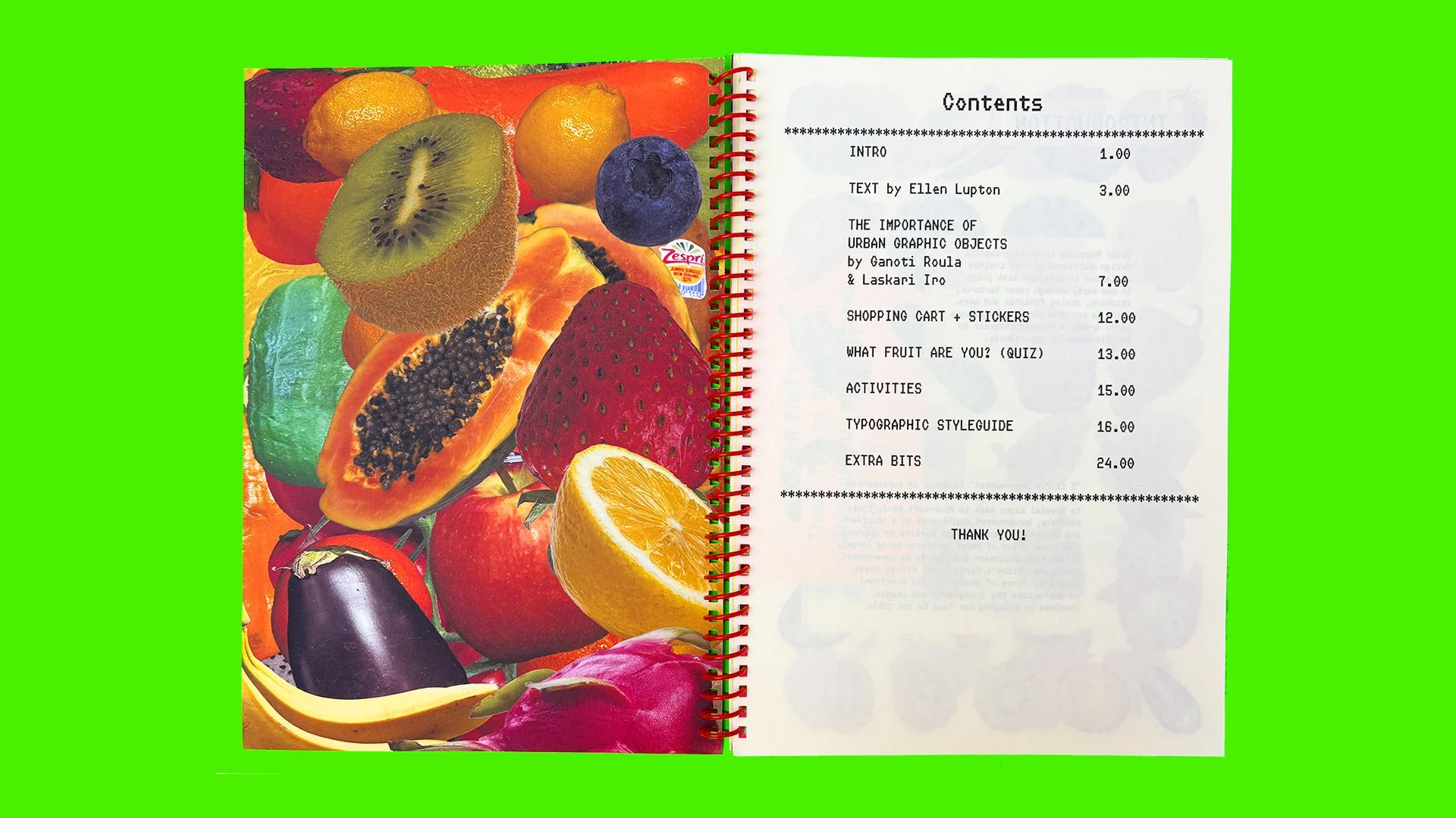

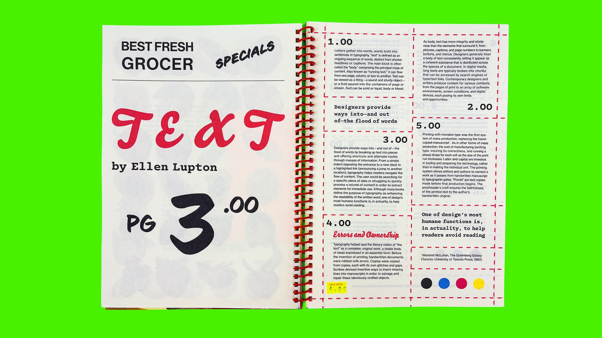
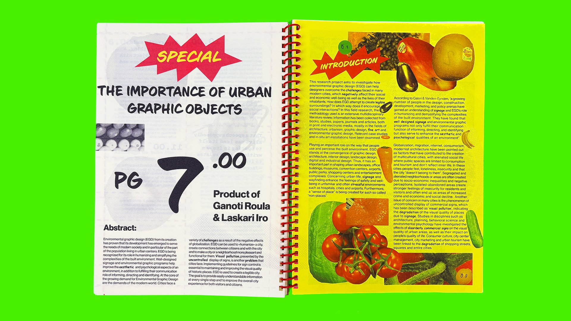
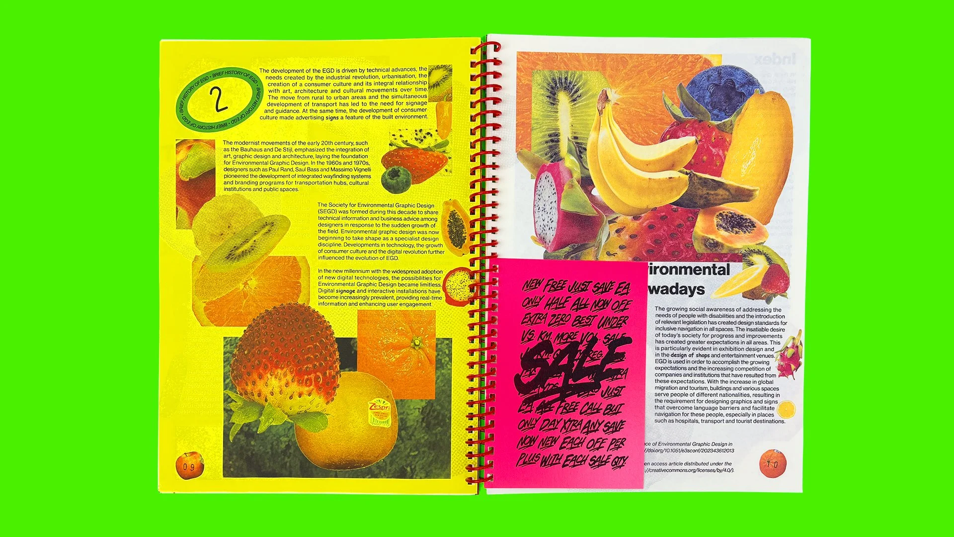

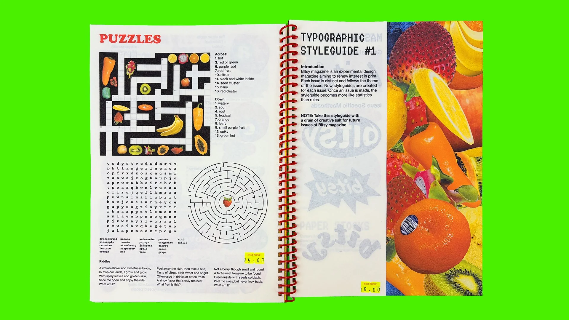
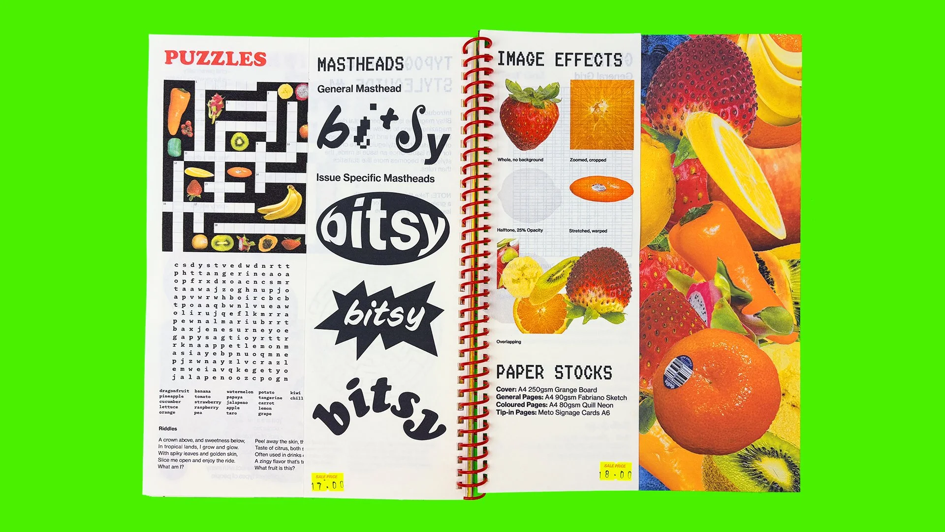

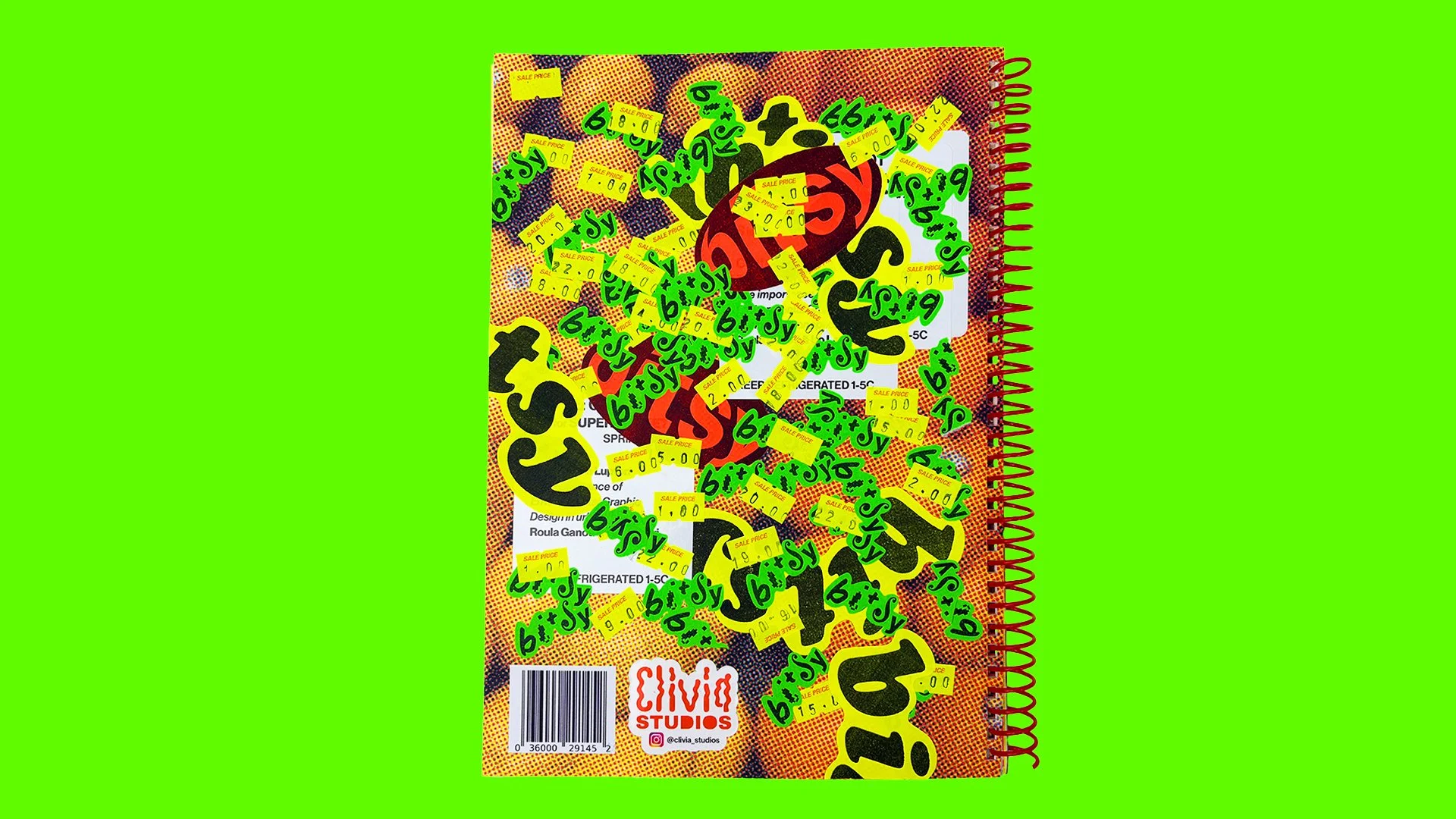
Bitsy Magazine was a project designed to teach me more about typography and typesetting. I was given two articles and had to create a grid and layouts with images and text based on a concept, connected to the content. Bitsy is an experimental design publication that invites audiences to interact with print in new ways, creating a renewed interest in tactile magazine experiences. This issue of the magazine is based on supermarket aesthetics, from fluorescent shipping labels to fruit stickers, fruit cartons and signs made in Word.